A DISTANT SOIL: The Ascendant Chapter 1 Page 11
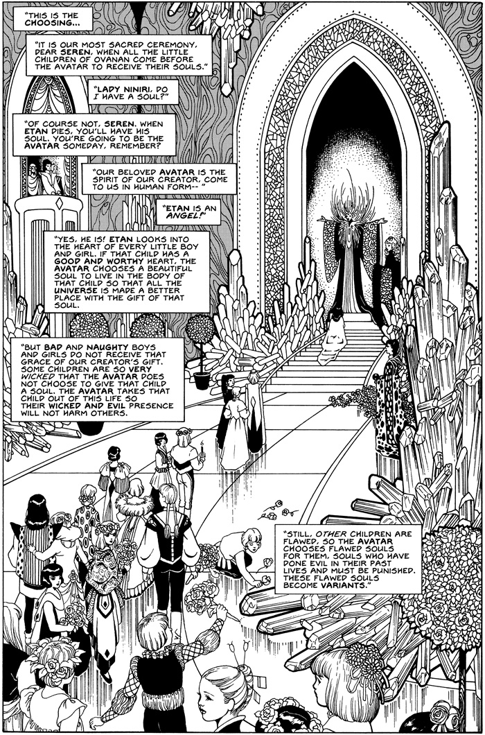
If you’ve been reading this comic online, you may have noticed a strong change in the inking style over the last 200 pages. I drew the first 180 pages of the book around 1986, then picked the project up again in 1991, adding a few splash and expository pages. I didn’t continue the story until years later, 1995.
When I started drawing the book in the 1980’s, my inking style was very smooth. Later, it became harsh and edgy. I think I may have been responding to criticism that my work was “too pretty”. Women cartoonists were routinely dismissed for pretty work, while artists like Mike Kaluta received nothing but praise for it. (The double standard still rankles.)
I can’t recall my mindset at the time, but changing to a rougher inking style was a mistake. At one point, Epic Comics (a division of Marvel) made an offer to publish ADS. An editor there, Mary Jo Duffy, criticized the rougher style I had adopted. I now realize she was right, though I did not accept the Epic contract, anyway. I appreciated the time Archie Goodwin and the staff spent talking with me about my work.
When I picked up the series again, I went back and smoothed out some of the ink lines on earlier pages. When I produced all-original work, the inking became much more attractive and fully integrated. By this time the lettering had also improved, though I don’t think I will ever be a particularly adept letterer.
I’ve decided to complete every aspect of this book by hand, so until the very end, every page will continue to be hand lettered and all tones are hand applied. Stippling and most other details are also by hand, though I did acquire Japanese tone sheets in 1996.

6 Comments
Dean
I remember Jagged-Colleen period.
It was during the time when certain artists were being routinely complimented for being “gritty.” Harsh became a style, and there were many fans who raved about “gritty” artwork. I blame the period.
“Too pretty.” We should all be so criticized.
Colleen
Jagged and gritty works for some book like Sandman, but it has no place in A Distant Soil. If I had the time, i would go back and retouch every page. Again. But I won’t.
Ms Ampersand
Mmm… This and the following pages are among my absolute favourites art-wise. The content is pretty scary (great though, I think), but the smooth black-and-white art is particularly yummy.
I don’t think ADS needs colour at all. Colour would only turn the attention away from the brilliant inks.
Colleen Doran
UPDATED
Aprillen
I really do love what you call the “pretty” style! The harsher style wasn’t bad, it was still very good art, but I definitely prefer this style. Thank you!
Colleen Doran
Thanks! I would not go back and redo, but I think it’s a perfect example of how you can let yourself be derailed by criticism.