Knights of the Angel
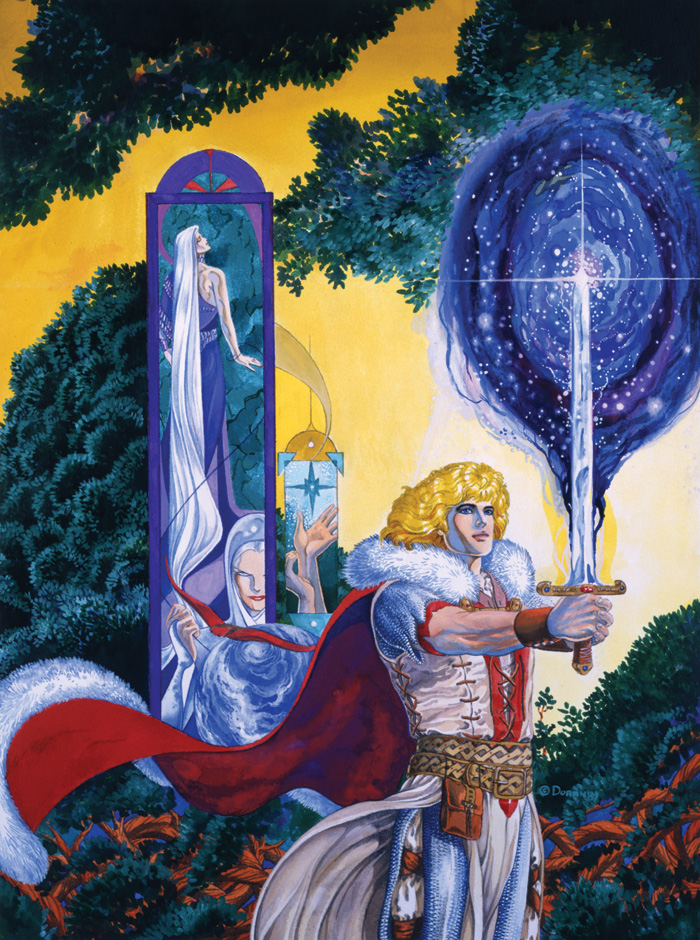
This is the cover art from an early, out of print edition of A DISTANT SOIL.
I hired a photographer to shoot my covers, and this is scanned from a negative. It’s not particularly good quality, but back then, I had no way to judge the quality of the archives I was getting.
The original art is painted in colored ink.
The big difference between this edition and the current edition is that the interior art is in color. However, the printing was really garish. Also, my inking line took on a really hard edge when I was working on this book. I think I responded to pressure that my art was too soft and “girlish”. Looking back, this is the only sequence in the book where I don’t think most of the art holds up because the inking style is so hard.
A comics critic once told me that he thought it was remarkable that my art on A DISTANT SOIL has remained so consistent over the years, but I think this guy must have a dead eye. I can see a roller coaster of visual glitches and influences.
I’ve met a few people who say they miss having the book in color, and while color is nice, this edition isn’t really very nice. It’s just in color.
There were two volumes entitled “Immigrant Song” and “Knights of the Angel”, 60 pages and 120 pages respectively. They are now included in A DISTANT SOIL: THE GATHERING in their entirety. However, The Gathering is 240 pages, so has a lot more story content. Since this edition, all the work was drawn with black and white reproduction in mind.

5 Comments
Colleen Doran
Galahad has very fluffy hair in this picture.
Michael Link
I think this was my very first exposure to A Distant Soil. When I picked up the graphic novels originally, I as wondering why everything was in black and white. =)
Stampers Saverem
I enjoy all the symbolism in this one.
Jim
Of course you see a roller coaster of stuff, Colleen — you are deeply embedded in your work. (We are our own worst critics.) For the rest of us, while we see definite refinement/maturity over the year, the core of your work and the general style remain readily recognizable. (Speaking as someone who has some of your work going back to before the volume this is from was released.)
Stewart Vernon
You’re going to be your own harshest critic, well except for jerks who have nothing better to do… to me, this looks pretty nice. My eye goes to the color first, because it is there, and next to the details in the hair and the fuzzy-wuzzies at the ends of the cape. Also lots of good stuff going on in the background with the trees.